The avatar grew from 26px to 38px, so the chevron's size and weight are now out of proportion with it. Each option is shown at rest beside the real 22px bell, so the whole cluster — bell, chat with its count, then the trigger — can be judged together.
With three marks present the chevron reads as a fourth icon rather than a modifier on the avatar — at full --ink-900 it carries the same weight as the bell and chat glyphs, so nothing in the cluster recedes. The 8px gap also lets it drift from the face it belongs to.
My pick. What the design system actually specifies: 16px in --ink-600, 6px apart. Grey drops it below both glyphs — and well below the flame count pill, the brightest thing in the cluster — so the photo leads and the chevron reads as its disclosure. The tighter gap binds the two into one control. Scales correctly against 38px because the ratio, not the pixel value, is what was specified.
Recommendation: 2b — return to the specified 16px / --ink-600 / 6px now that the avatar is 38px. The photo becomes the thing you aim at and the chevron reads as its disclosure, which is what the enlargement was for.
Identical rows, identical order, identical type ladder. What differs is how the panel is divided and how a row shows it is live. All three sit under a real 48px profile control so the anchor is honest.
Eight rows arrive as one undifferentiated column — you read every label to find one. The hover wash runs full-bleed, so at 250px the panel feels like a list rather than a menu.
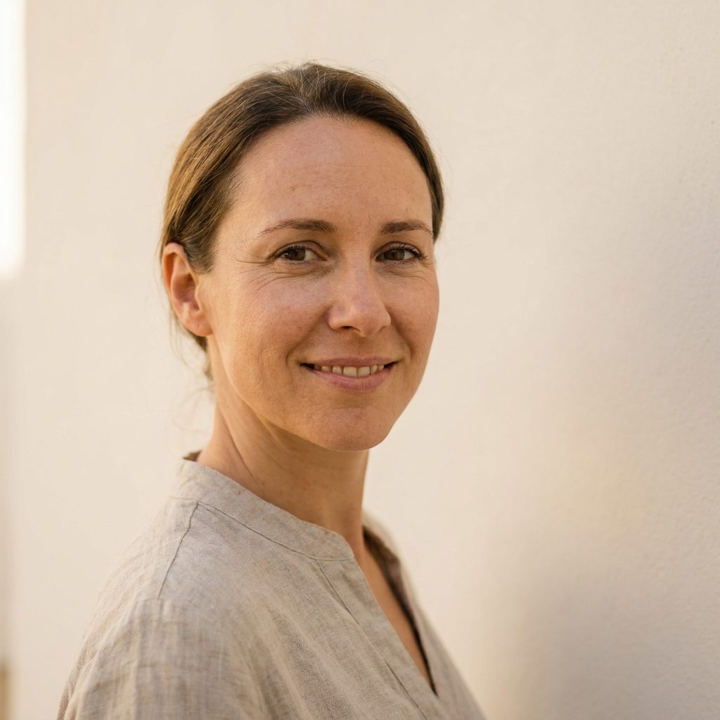
My pick. Three captions replace two rules — you jump to a group instead of reading eight labels. Hover is an inset rounded wash, so it reads as a target with edges. The photo repeats beside the name, which is what confirms the account.
LC Lee
Homeowner
Each glyph gets a tinted tile, so rows scan by shape at speed and the panel reads as app navigation. Costs height — 44px rows push it to ~470px — and the plates compete with the room thumbnails elsewhere on the page.
Recommendation: 1b. It fixes the real problem — eight equal rows with nothing to aim at — using the system's own caption style and the inset hover it already uses on cards, and it costs no extra height. Say the word and I'll roll it across the seven desktop pages.